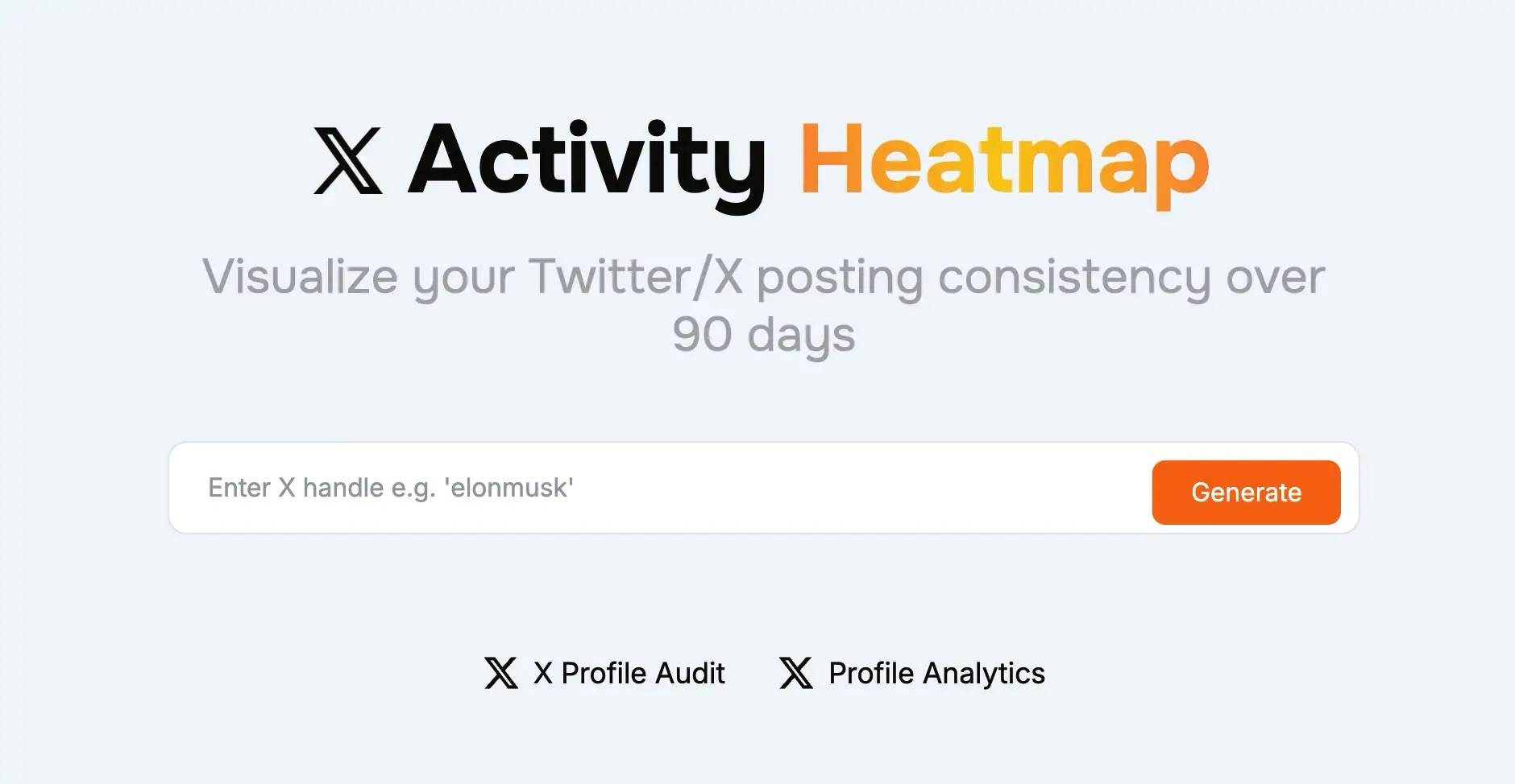
𝕏 Activity Heatmap
Free X activity heatmap generator to visualize your Twitter/X posting consistency
Track your posting streak and patterns with our X activity heatmap tool
✓ Free X activity heatmap • ✓ 90-day visualization • ✓ No signup required
Powerful X Activity Heatmap Features
Our X activity heatmap tool provides comprehensive visualization and insights to help you track and improve your posting consistency on X
90-Day Activity Visualization
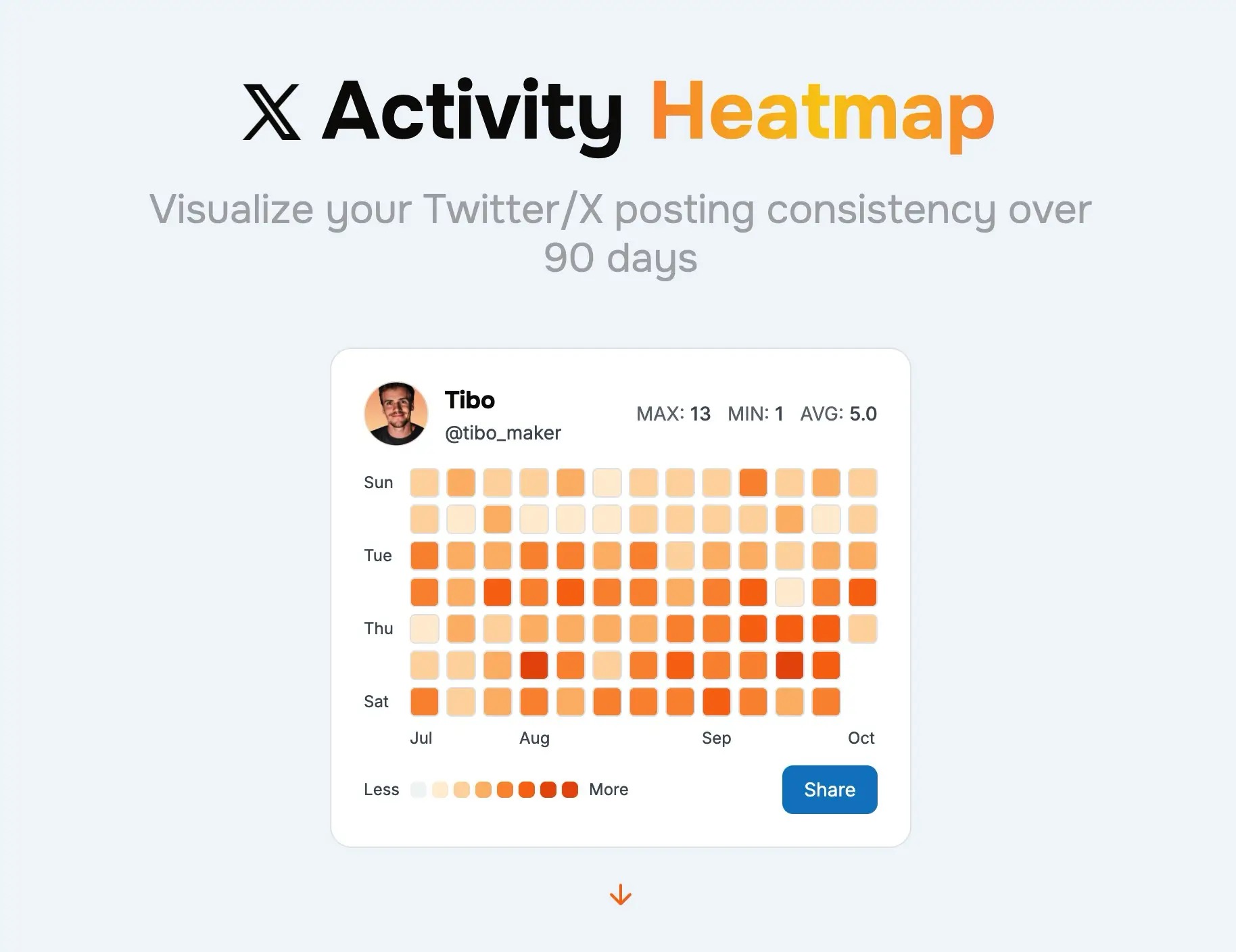
Generate a comprehensive X activity heatmap showing three months of posting history with color-coded intensity to reveal your consistency patterns.
Automatic Streak Tracking
Your X activity heatmap automatically calculates and displays your current posting streak, motivating you to maintain daily consistency.
Activity Statistics
Get detailed metrics from your X activity heatmap including daily average posts, maximum activity days, and total tweet count.
Shareable Heatmap Images
Download your X activity heatmap as a beautiful image to share on social media and showcase your consistency to your audience.
Real-Time Data
Every X activity heatmap is generated with live data directly from X/Twitter, ensuring your visualization is always current and accurate.
Instant Generation
Create your X activity heatmap in seconds—no signup, no waiting. Just enter a username and get your heatmap visualization instantly.
Our free X activity heatmap generator helps thousands of users daily visualize their posting patterns. Whether you're tracking your own consistency or analyzing competitors, get the insights you need with our beautiful, GitHub-style X activity heatmap.
Why an X Activity Heatmap Matters
Your X activity heatmap is more than just a pretty visualization—it's a powerful tool for understanding and improving your posting consistency on X/Twitter.
Visualize Posting Patterns
An X activity heatmap provides an instant visual overview of your posting habits over 90 days. Quickly identify gaps in your schedule, spot your most active periods, and understand your consistency at a glance with your personalized X activity heatmap.
Track Your Consistency Streak
The X activity heatmap automatically calculates your current posting streak, showing consecutive days of activity. Maintaining a strong streak visible in your X activity heatmap motivates consistent posting and builds audience trust.
Hold Yourself Accountable
Using an X activity heatmap helps you stay accountable to your content goals. Seeing gaps in your heatmap motivates you to maintain regular posting habits, while a filled X activity heatmap provides satisfaction and proof of your dedication.
Optimize Your Posting Schedule
Analyze your X activity heatmap to identify when you post most frequently and correlate it with engagement data. Use insights from your X activity heatmap to optimize your content calendar and maximize your reach on X.
Make Your X Activity Heatmap Work for You
Whether you're building an audience, growing a brand, or establishing thought leadership, your X activity heatmap provides valuable insights into your consistency. Generate your free X activity heatmap today and take control of your posting strategy with visual, data-driven feedback that helps you stay on track.
How to Generate Your X Activity Heatmap
Create your X activity heatmap in three simple steps. Visualize 90 days of posting history instantly with our free tool.
Enter X Username
Type any X/Twitter username into our X activity heatmap generator. You can create a heatmap for your own profile or analyze any public account—no login required.
Data Analysis
Our X activity heatmap tool fetches posting data from the last 90 days and analyzes daily tweet counts, activity patterns, and consistency metrics to create your visualization.
View & Share Heatmap
Your X activity heatmap appears instantly with color-coded squares showing your posting patterns, streak count, and statistics. Download and share your heatmap image to showcase your consistency.
Ready to Create Your X Activity Heatmap?
Join thousands of users who track their consistency with our X activity heatmap tool. Generate your free heatmap now and visualize your posting patterns to improve your content strategy and maintain your streak.
Generate Your X Activity HeatmapBenefits of Using an X Activity Heatmap
Regularly checking your X activity heatmap helps you maintain consistency, identify patterns, and grow your presence on X/Twitter.
🔥Build and Maintain Streaks
An X activity heatmap makes your posting streak visible and motivating. Seeing consecutive days of activity encourages you to maintain your momentum. Long streaks on your X activity heatmap demonstrate commitment to your audience and help establish you as a consistent creator.
📊Identify Posting Patterns
Your X activity heatmap reveals patterns you might not notice otherwise. Spot which days of the week you're most active, identify posting gaps, and understand your natural rhythm. Use these insights from your X activity heatmap to optimize your content schedule.
🎯Stay Accountable to Goals
The visual nature of an X activity heatmap provides instant accountability. Empty squares on your heatmap stand out, motivating you to fill gaps and maintain consistency. Use your X activity heatmap as a daily reminder of your commitment to building your X presence.
📈Improve Algorithm Performance
Consistent posting tracked by your X activity heatmap positively impacts the X algorithm. Regular activity signals to X that you're an active, engaged user, potentially boosting your content's visibility. A solid X activity heatmap often correlates with better reach.
🤝Build Audience Trust
Sharing your X activity heatmap shows your audience your dedication and reliability. A consistent heatmap demonstrates that you're committed to providing regular content. Followers appreciate creators who show up consistently, as reflected in your X activity heatmap.
💪Track Your Progress Over Time
Generate your X activity heatmap regularly to see how your consistency evolves. Compare heatmaps month-over-month to track improvements, identify when you were most consistent, and celebrate milestones. Your X activity heatmap becomes a visual record of your growth journey.
Start Tracking Your Consistency Today
Whether you're a content creator, brand, or aspiring influencer, our free X activity heatmap tool provides the visual feedback you need to stay consistent. Create your X activity heatmap now and take the first step toward building unbreakable posting habits.
Frequently Asked Questions About X Activity Heatmap
Everything you need to know about creating and using an X activity heatmap
Ready to Visualize Your Consistency?
Start tracking your posting patterns with our free X activity heatmap. See your 90-day streak, identify gaps, and maintain consistency with beautiful GitHub-style visualization. Trusted by thousands of X users daily.
Generate Your X Activity HeatmapFree forever • No login required • Instant results
More Free X Tools
Explore our other tools to optimize your X presence